
How to Combine Social Media, SEO, and Paid Advertising in One Marketing Strategy
How social media, SEO and paid advertising each play a different role, and how to connect them with one message, shared audiences and consistent measurement.
A practical checklist for small business websites — clear positioning, page structure, trust, speed, mobile usability and enquiry paths that make it easy to get in touch.
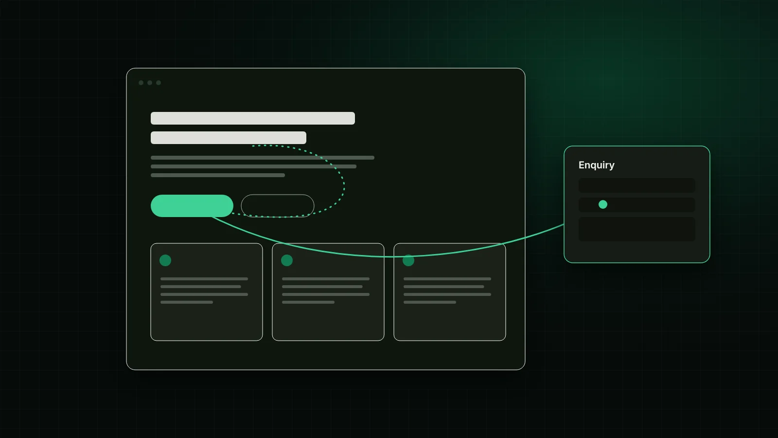
A small business website turns visitors into enquiries when it answers three questions quickly — what you do, who you do it for, and how to start — and then removes every unnecessary obstacle between interest and contact. Design matters, but clarity, speed, trust and a visible next step usually matter more.
This guide walks through the elements we check first when we review a small business website, with practical examples you can apply whether you are redesigning or improving what you already have.
The top of your homepage has one job: help the right visitor recognise that they are in the right place. A strong first screen usually includes:
If a visitor needs to scroll or click before understanding what you sell, many will not bother. Test this by showing your homepage to someone outside your business for five seconds and asking them what you do.
Visitors arrive with questions. Your page structure should answer them in roughly the order they occur. For most service businesses, that order looks like this:
Each main service deserves its own page rather than a single long list. A dedicated page lets you explain who the service is for, what is included, and what happens next. It also gives search engines a clear page to show for that topic. Google's own guidance encourages content created primarily to help people rather than to attract search traffic (Google Search Central).
Most people scan before they read. Use descriptive headings, short paragraphs, bullet lists for deliverables, and FAQs for common objections. If someone reads only your headings, they should still understand the page.
Visitors look for signs that you are real, capable and accountable. Useful trust signals include:
Avoid inventing statistics, testimonials or badges. Fabricated proof can damage trust permanently when discovered, and in many countries it can break consumer protection rules. If you are new and do not yet have testimonials, explain your process in detail and show example work instead. Specific detail builds more confidence than vague claims.
For many local and consumer-facing businesses, a large share of visitors arrive on phones. On a small screen:
tel: links and email addresses mailto: links.Do not simply shrink the desktop layout. Reorder content so the most important information appears first on mobile.
A slow website feels unreliable. Large, uncompressed images, too many plugins and heavy third-party scripts are common causes. Google's Core Web Vitals measure loading performance, responsiveness and visual stability, and give site owners specific targets to work towards (web.dev).
Practical improvements that help most small business sites:
An enquiry path is the route from "I'm interested" to "I've made contact". It should be easy to find on every page and easy to complete.
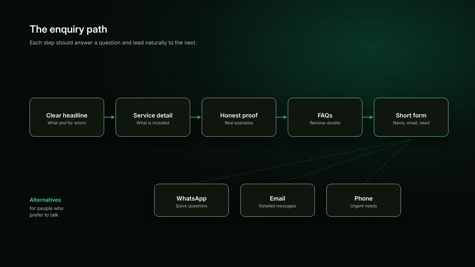
Different people prefer different channels. A contact form suits detailed enquiries; WhatsApp suits quick questions, especially for audiences in the UAE and Pakistan where it is widely used; phone suits urgent needs. Show the options clearly and make sure each one is monitored.
Ask only for what you need to respond well. Name, email, the service of interest and a short description are often enough for a first contact. You can ask for budgets, timelines and documents later in the conversation. If you do ask for optional details, label them clearly as optional.
After someone submits a form, show a clear confirmation and explain the next step. Do not promise response times you cannot meet. "We'll review your message and reply by email" is better than an unrealistic guarantee.
An accessible website works for more people, including those using screen readers, keyboard navigation or larger text. It also tends to be clearer for everyone. The Web Content Accessibility Guidelines provide an internationally recognised standard (W3C WAI). At a minimum:
Install analytics and track the actions that represent real interest: form submissions, WhatsApp clicks, phone clicks and email clicks. Without this, you cannot tell which pages and campaigns are working. Review these numbers monthly and compare them with the enquiries your team actually receives.
Use this list to review your current site:
| Area | Question to ask |
|---|---|
| First screen | Can a new visitor tell what you do within five seconds? |
| Services | Does each main service have its own clear page? |
| Trust | Is every claim on the site true and verifiable? |
| Mobile | Are text, buttons and forms comfortable on a phone? |
| Speed | Are images compressed and unused scripts removed? |
| Enquiries | Is a contact option visible on every page? |
| Forms | Do you ask only for what you need right now? |
| Measurement | Are form, WhatsApp, phone and email clicks tracked? |
A website that generates enquiries is rarely the most elaborate one. It is the one that explains clearly, loads quickly, works well on phones, earns trust honestly and makes the next step obvious. Start with the first screen and the enquiry path, then work through the checklist above.
If you would like a second opinion on your current site or are planning a new one, our website design and development team can review it with you, and our landing page and SEO services can help each campaign and search visitor find the right next step.
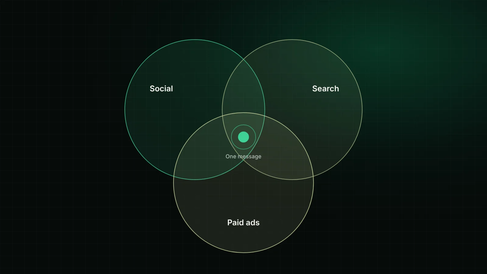
How social media, SEO and paid advertising each play a different role, and how to connect them with one message, shared audiences and consistent measurement.

How small and mid-sized businesses can use AI automation to capture, route and follow up enquiries and to support customers faster — while keeping people in control.